INGLES REBRAND / LOGO REDESIGN
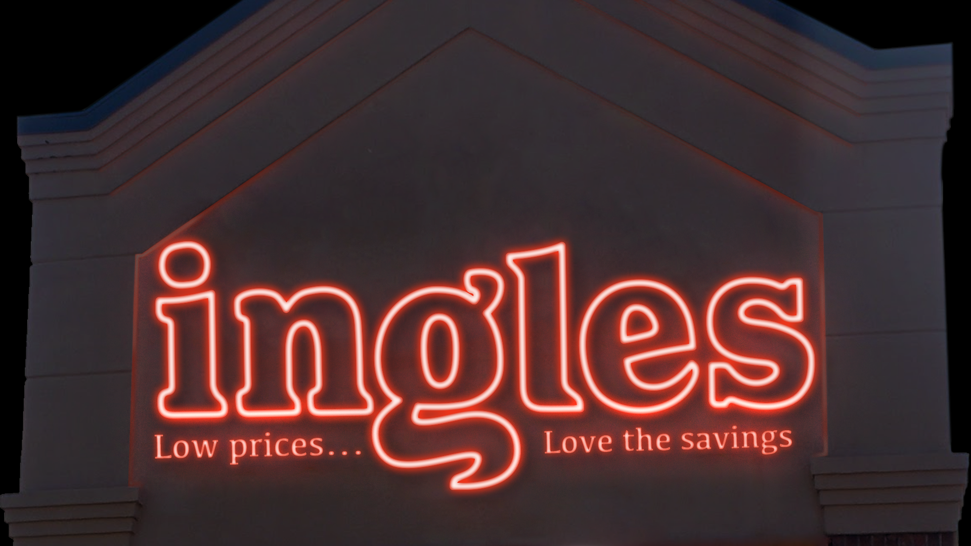
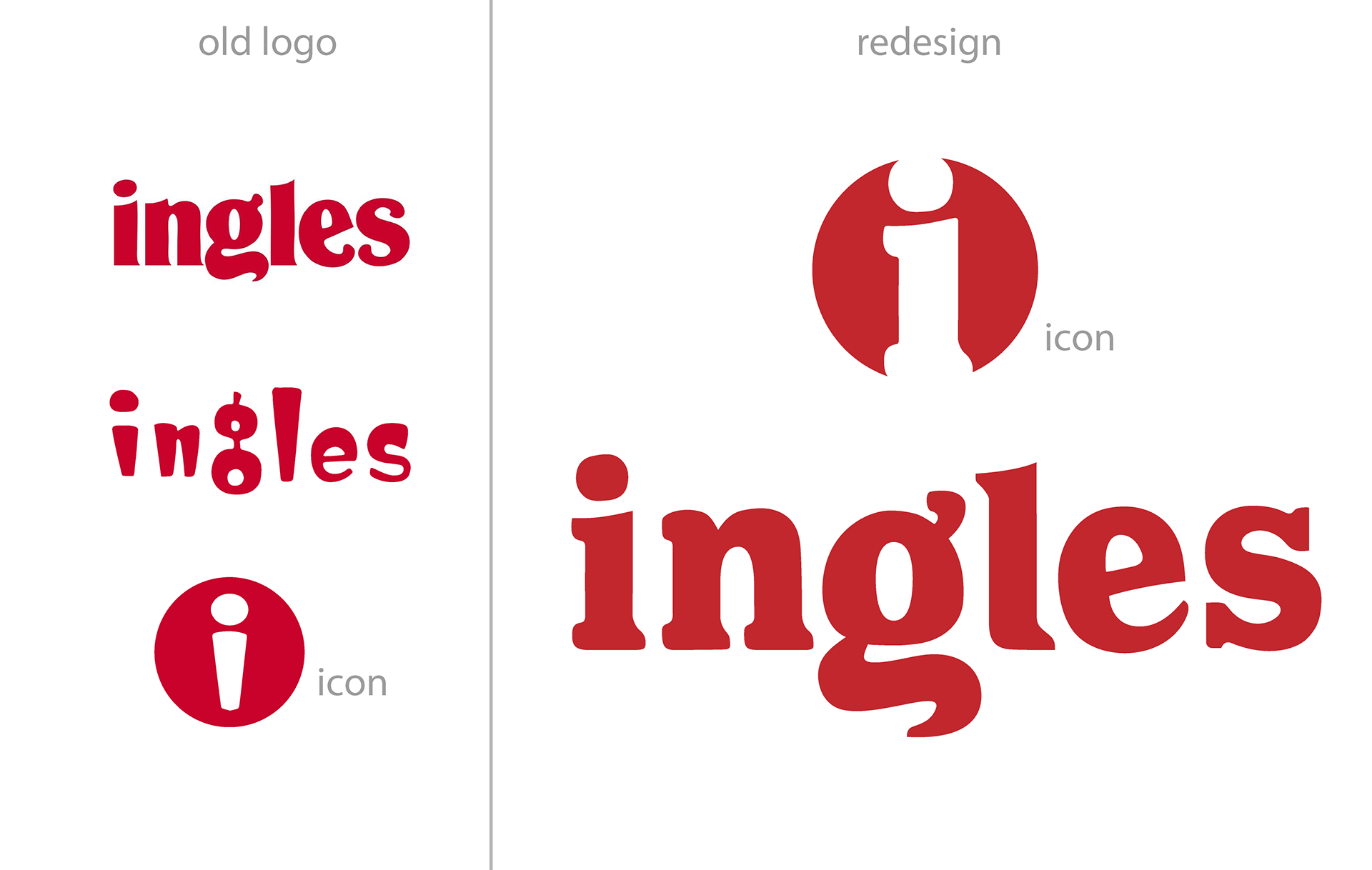
The current logos of Ingles Markets is outdated and inconsistent with the brand. The two logos are used for different purposes, the top logo is printed on items and trucks while the bottom is displayed on the main signs and on the storefront. The tracking in the printed logo is very congested and makes the whole design feel unnatural and forced. The logo used on signage is uncomfortably top-heavy and is extremely outdated rather than charmingly retro as the design has not been changed since Ingles' establishment in 1963.
I chose to implement aspects from the printed logo and create a single, universal design that would be used across all platforms, creating a more consistent visual language across the brand. The key elements I identified in both logos are approachability, friendliness, and modesty. A company like Ingles needs a sturdy, timeless font rather than trendy or forced retro designs that communicates the respectability of the brand and its ideals.
The use of a slab serif font (Los Feliz OT Bold, modified) and wider tracking creates a visual openness and maintains the strength and approachability while implementing the playful, friendly language of the slightly tilted "e" and modified "g" from the current logo. This new logo is classic and timeless while communicating Robert Ingles's self-sufficient, family-centered business ideals that have made this grocery store a prominent chain in the mountains of Western North Carolina.
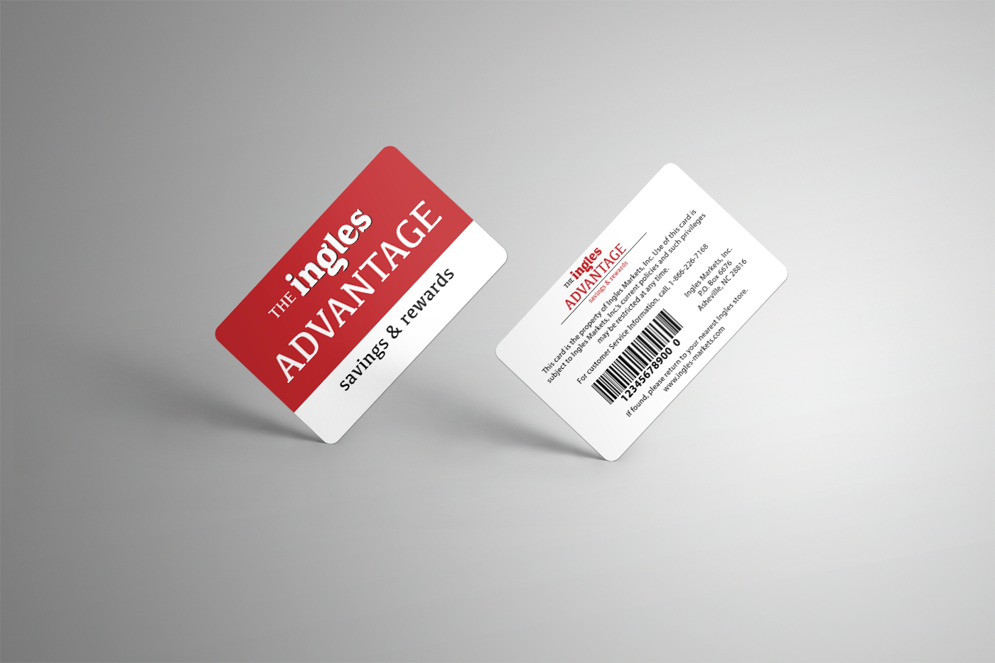
INGLES ADVANTAGE CARD
This new design is similar to the original but is simplified significantly by paring down to only serif fonts and a single sans serif for the information on the back of the card. The original card includes a yellow bar but this new design uses only the key red, black, and white scheme that is consistent throughout the entirety of Ingles' branding.